


charts
Visualize your data in different ways; each of them animated and customised.
-
06 Dec 2022
-
06 Dec 2022

Pie
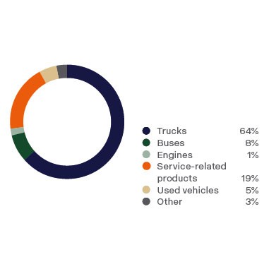
Pie and doughnut charts are probably the most commonly used charts. They are divided into segments, the arc of each segment shows the proportional value of each piece of data. -
06 Dec 2022

Charts
Charts are graphical representations of data. Charts make it easy to understand large quantities of data, find patterns and relationships and identify trends. -
06 Dec 2022
Line
A line chart is a way of plotting data points on a line. Often, it is used to show trend data, or the comparison of two data sets. -
06 Dec 2022

Bar
A bar chart provides a way of showing data values represented as vertical bars. It is sometimes used to show trend data, and the comparison of multiple data sets side by side. -
06 Dec 2022

Doughnut
Pie and doughnut charts are probably the most commonly used charts. They are divided into segments, the arc of each segment shows the proportional value of each piece of data.